First Lesson
Color bias was one of the first lessons I learned when I started learning about watercolor painting. Understanding color bias is useful, particularly in mixing color and creating color mood.
Early Advice – Look For Color Bias
Early in my watercolor painting education, I received some guidance and advice from family friend and retired Arts Student’s League instructor Mr. Vincent Malta. One idea he shared was that all colors have a bias. They have a warm bias or cool bias. Warm bias would be a tendency for the pigment to have a little bit of red or yellow in it; cool bias would be toward blue.
 For personal clarification, and to assist in color mixing, I refer to the bias as toward yellow, red or blue.
Primary Colors
To begin, lets consider the three primary colors – red, blue and yellow. Easy enough. Yellow and red are considered warm colors – think fire. Blue is a cool color, like ice.
But, its not quite so easy because of pigment bias. That is, most yellows have either a slight red or blue tinge. Reds are either just a tad bluish or yellowish. You figured it – blues either slightly yellow or slightly red.
Why is this important? Color mixing. Color mood.
In other words, color bias can be huge!
 Color Wheel – Simplified
To explain, I thought I’d create a simple color wheel. I selected two examples of each primary color from my watercolor palette. I created a wheel, arranging them according to bias or tendency.
Regarding the yellows, new gamboge has a bias toward red; hansa yellow tends toward blue.
The reds I selected are scarlet lake – yellow bias, and quinacridone rose – blue bias.
The blues I chose are Prussian blue – yellow bias, and French ultramarine blue – red bias.
For Instance…
Lets do a “for instance”. If you mix two primary colors with a bias toward each other, then you get a more “clean” color. If you mix two primary colors where a third is present through bias then you get a “muddied” color. Its best to look at pictures.

Two Primary Color Mixing
Above are the pairings of my paints if I only want two primaries in the mix:
- new gamboge (red bias) mixed with scarlet lake (yellow bias)
- quinacridone rose (blue bias) mixed with French ultramarine blue (red bias)
- Prussian blue (yellow bias) mixed with hansa yellow (blue bias)
Clear as mud? 🙂
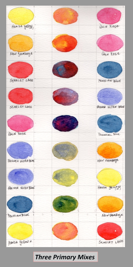
Three Primary Color Mixing
Compare the two primary mixes with pairings where all three primaries are present.
- hansa yellow (blue bias) mixed with quinacridone rose (blue bias)
- new gamboge (red bias) mixed with quinacridone rose (blue bias)
- scarlet lake (yellow bias) mixed with Prussian blue (yellow bias)
- scarlet lake (yellow bias) mixed with French ultramarine blue (red bias)
- quinacridone rose (blue bias) mixed with Prussian blue (yellow bias)
- French ultramarine blue (red bias) mixed with new gamboge (red bias)
- French ultramarine blue (red bias) mixed with hansa yellow (blue bias)
- Prussian blue (yellow bias) mixed with new gamboge (red bias)
- hansa yellow (blue bias) mixed with scarlet lake (yellow bias)
You might notice that even though the mix might be interesting, the colors aren’t “pure”, or clean.
For example, French ultramarine blue (red bias) and hansa yellow (blue bias) create a muted green. I might use this green in depicting the soft greens of desert sage. I would not use the mixture to depict the bright, clean greens of new leaves
Idea Restated
Just to re-interate, two primaries mixed together results in a cleaner, often more vibrant color. Three primary colors mixed together create more muted, muddied and sometimes richer colors.
And, they’re all good! The subtle differences help the painter use color to meet expressive intent – that is to say color mood.
So, now what?
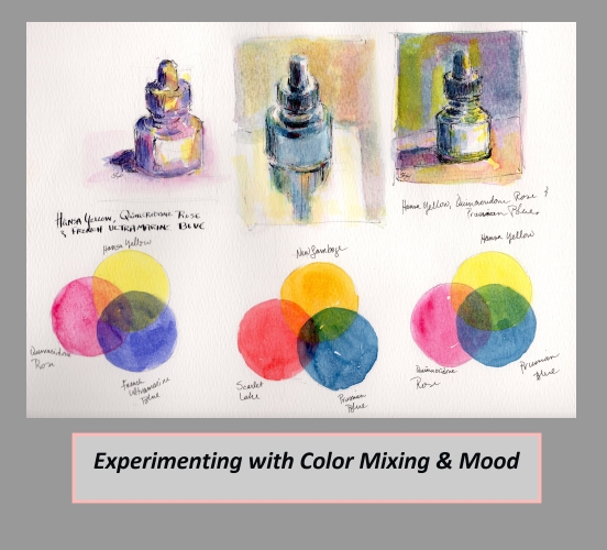
I recommend looking at your own palette and experimenting. Create triads of reds, yellows and blue and think about each pigment’s color bias. Then, do a small study. What kind of mood do you create? How about the colors? Is it useful to you?
Experiment
With the left triad, you might notice that all three pigments have a cool bias. With the middle triad of pigments, there is a warm bias. The right most triad has a mixed bias, though I would say that it is cool dominant since both hansa yellow and quinacridone rose tend to be cool.
Share!
Please feel free to comment about your own explorations in color bias and mixing. If you do a blog post of your own color pallet and experiments, please share your link! Thanks!
PS.
Though I talk about watercolor paint, the principle of bias applies to all pigments and paints, from color pencil to oils.
Hello Peggy,
I was just reminded of a comment I saw lately. It advised not using Gamboge because it will turn brownish. Have you had that experience?
I used it often several years ago, but not lately, so don’t have any recent experience with it.
I applaud your effort here, good for you. I’ll do some reading through your archives.
Thanks,
Hazel
Hi Hazel, thank you for the comment. Are you talking about Gamboge or New Gamboge? I use new gamboge, which I understand is not the same formulation as gamboge. That being said, I had not heard of either of them turning brown. I would be interested to know if they do.
I had heard of aureolin (cobalt yellow) turning brown so I don’t use it anymore.
What is your preferred yellow? I tend to use hansa yellow (medium) for pretty much all my yellow!
Is there a list of all the major oil colors and their bias?
Hi Andy, I do not know if there is. I do not work with oil paint and therefore have not researched the matter. I do know that artist Todd M. Casey has recently published a book on color for oil painters. However, I don’t know if he covers that topic.
Thank you so much for asking the question!
By the way, have you checked with your favorite paint manufacturers? I learned quite a bit from Daniel Smith’s documentation on their watercolors
Good luck! Peggy