The Value of Color Studies.
Greetings! I am going to give you a short introduction about why I do color studies, then outline how I devised my own color study project. Finally, I’ll share with you some of the lessons I learned by doing the studies.
And, I might add, it is the “doing” that is critical! Some lessons are best learned by doing them for ourselves.
Story Time.
A couple of months ago, I was chatting with a fellow local watercolor artist. She was taking beginning watercolor classes but thought she was ready for more advanced study. In particular, she would like to attend a class on color.
Oh, yes, you might imagine visions of being an instructor danced through my head. I could do this! And then I started imagining how I might teach a class on color. The question “what was useful for me, and how did I learn color” popped into my head.
Why Do Color Studies? To Learn.
I’m not certain that we ever stop learning about color. But, what has helped me gain knowledge about the properties of color is doing color studies. And, periodically I do lots of them.
Oh, and, they are fun. The studies are a great exercise for improving skills. Or, if going through a period of the dreaded “artist block”, try doing some color studies to get the proverbial creative juices flowing.
How I Did My First Big Color Project.
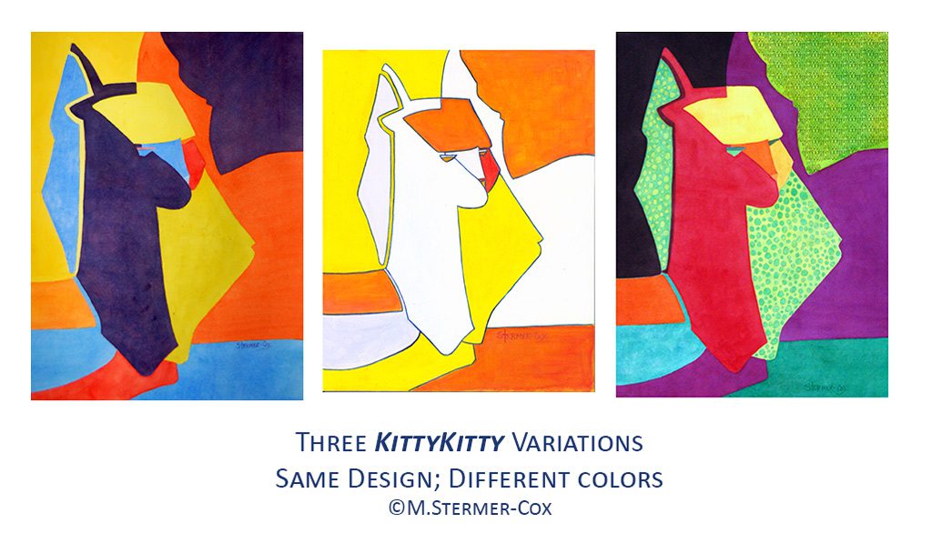
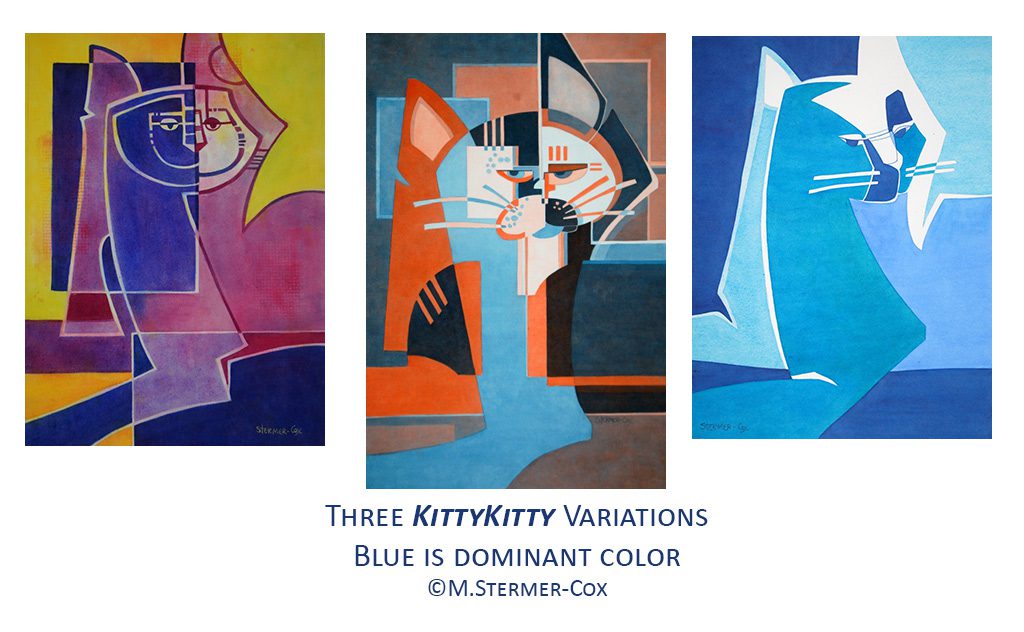
I selected a drawing I had already done. This particular drawing was of a cat and I figured I’d like to do a finished painting or two (or twenty) using this particular cat pose. So I created a color study project for myself.
Rules.
Here were the rules I used. And, I do believe setting “rules” helps the project stay focused and move along. Besides, since you set your own rules, they are subject to your goals.
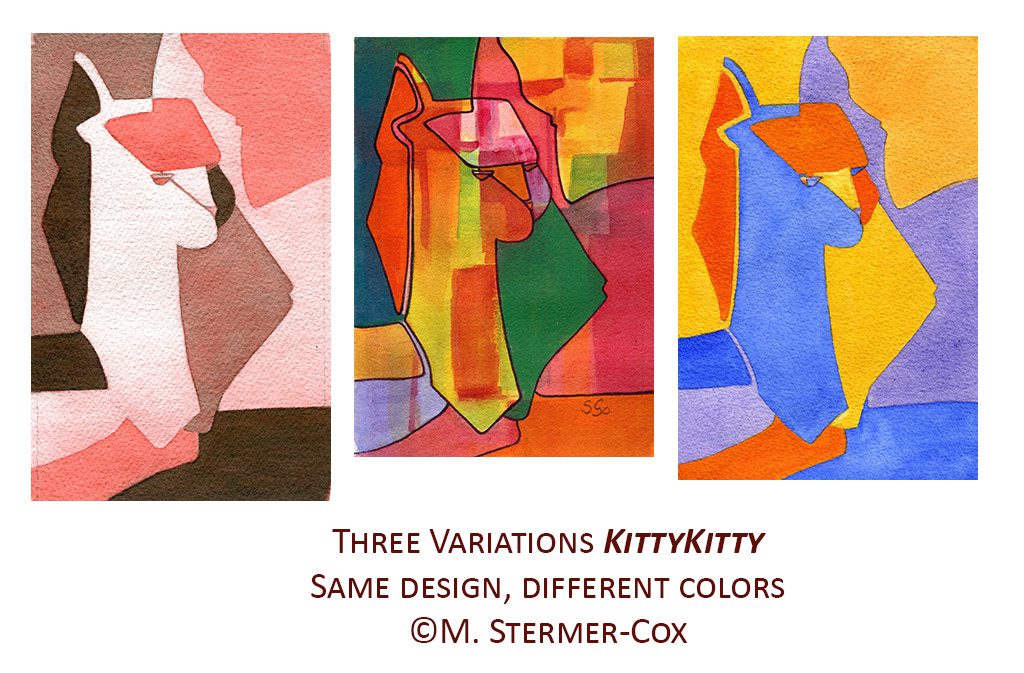
- Set One: Use the same drawing as the starting point*. Vary the color: select color combinations like complimentary, monochrome, or triads that might be fun. See what happens, see how expression changes with color variation.
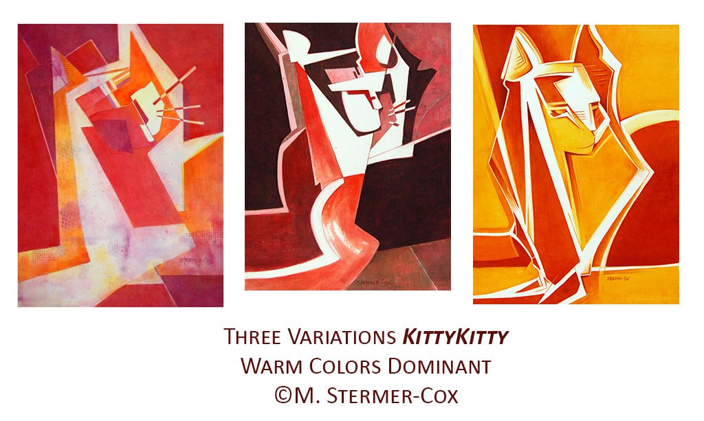
- Set Two: I varied line and shape quality in the design plus varied color. For example, red might appear more expressive if the lines were straight, geometric and angular. However, red might appear sweeter, more feminine if the line quality was curved, organic, and rounded.
- Do lots!
- Note: By the way, if you want to do color studies, you can also make up a simple, pleasing composition of geometric shapes. You don’t need a fancy drawing, just something to get the creative juices flowing.
And, thus, the “kittykitty” series was born.
What I Discovered.
In other words, these are things I read about in art books but needed to see, feel and learn by trying on my own.
No Bad Color.
I think it is difficult to get a “bad” color combination, though some color schemes might appear more dissonant or discordant; they clash. Sometimes, clashing colors are just what’s needed!
Other color schemes appear more harmonious; they go together.
Mood.
Color combinations can and do influence the mood of the painting. To clarify, think of blue and you might think of blue skies, or feeling blue, or true blue. How about red: red heart, seeing red, red skies. I think you get the picture: a color within the context of a painting can enhance mood.
Intensity.
Color brightness, or intensity, matters. Bright next to muted or grayed color is beautiful. Gray can be beautiful and colorful.
Value.
Color value matters too. I orchestrate color values for “carrying power” – that is you can see the painting from across the room.
- To illustrate, yellows read light and, with watercolor, have a hard time with carrying power. It is hard to see yellow from far away without a strong dark nearby. But, when you do, yellow sings!
- Reds are tricky because they tend to be in the mid range straight out of the tube. Mixed with its compliment, reds can make a beautiful, strong dark.
- Blues tend to be in the darker value range when used full strength. But, it is not always the case. A cobalt blue, for example, never gets as dark as a comparable ultramarine blue. Cobalt blue tends to stay in the mid range
Dominance.
Trying to compose a painting with every color on your palette can be a challenge. One painting almost made me dizzy! Having one color dominant helps clarify and strengthen the painting.
Limits.
Limiting color combinations, such as working with color combinations, makes the painting life ever so much “easier”; OK, relatively easier. You can use small touches of other colors to spice up the painting. But, simplifying color does help.
Next? How About You?
OK, I could probably go on for the next while on lessons learned. Let’s do this instead. I have shared several of my color studies on this page. Now, if you are interested, how about you? I would like to encourage you to do some for yourself and feel free to share.
OR, those of you who have been painting a long time and have done color studies, feel free to share your own comments and maybe an image!
Post Script.
No, I haven’t started teaching a watercolor class on color. The idea still dances around my head. And, that is why I’m doing this post, to start getting my own “creative juices” flowing for teaching.
Thanks!
