
Red and Green Challenge.
Every year about Christmas time, I want to write a blog posting about dealing with the complementary colors of red and green in paintings. You see, I find it a challenge to create a painting using red and green. If I’m not careful, the resulting image will look like it ought to be on a holiday greeting card.

Complementary Color Pair.
Just for some background, I would like to explain that I like working with complimentary color schemes. By “complementary”, I mean colors opposite each other on the color wheel. But, the symbolic association of red and green with Christmas time makes it tricky using the colors in a painting.

Strategies For Using Red And Green.
But, wait, yes, there are strategies painters, me included, can use to avoid Christmas colors if that is our aim. I like using the design principle of dominance as well as the properties of colors, that is value and intensity.
Plan B.
I also have a “plan b” where I adjust the relative temperatures of the colors by adding either yellow or blue. But, strictly speaking, I’m not working with complementary colors when I add yellow or blue.
So, I’ll show you some examples of my paintings where I have worked to deal with the issue of red and green as symbolic of Christmas.
Is Dominance Enough?
Truthfully, I figured that if I changed the dominance, that is to say instead of using a 50:50 ratio of red and green, that alone would work. So, I did a little color testing, changing the ration to something like 75:25 or 90:10. If everything else is the same, that is intensity or value, I think the colors still look like Christmas.
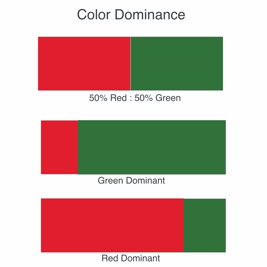
Dominance PLUS Value and Intensity.
However, if I use dominance along with something like value (relative light or dark) or intensity (relative purity or grayness), then I start to break the symbolic power of Christmas on red and green.
Examples: Still Life With Toy Pony.
For example, in the Still Life with Toy Pony painting I include, I have red as the dominant color. Then, I use green to darken and tone the red in some shapes, thus changing intensity. Plus, some areas are darker in value, that is closer to black, and others are white. So, it’s a three strategy painting…plus a little of plan b.

I have another example, one with green as the dominant color.

Conclusion: Strategy is Habit.
Kind of weird, don’t you think? As I sit here and think of my paintings, most use a combination of dominance, value and intensity as strategies to deal with color. And, yes, plan b slips in if I’m not careful. I didn’t realize I had established a habit. That is to say, my strategy is to use dominance, value and intensity together when composing with the complementary colors red and green.
So, to my artist friends, what is your strategy?
Further Reading:
Stephen Quiller, “Color Choices”.
Christopher Schink, Color And Light For Watercolor Painters.
PS. Christmas Breakfast?
